Designing: Project Calamity
The design for the Field Standard had just been finished.
“So what’s next? I guess a diver would be the natural progression.” Kyle said. Kyle is one of my most trusted friends, especially in terms of Orion, he was helping me from the beginning. I had no money and only my modding background. I made him a promise if the Orion 1 were successful and he agreed, totally on faith. At this point in time, around 2.5 years ago, we had just finished up with the Field Standard. Ideas, naturally, come before design. Our design process usually starts with a conversation, then me explaining what image is in my head, Kyle confirming that he understands what I’m saying then maybe some bad drawings and references - and BOOM! Kyle churns out wonderful renders.
When we started, he mostly let me do what I wanted, but as we grew closer our design language aligned and Kyle revealed himself as an insightful designer and confidant, invaluable to the process, but I digress.

“I guess that’s the next step..” A diver, yeah, Orion diver. People mentioned how cool the Orion 1 would look with a dive bezel. And I agreed, it would look cool, at this point in time people were still warming up to Orion as a brand, many stuck on the long lugs (that they would come around to later).
So that’s where it started, kind of, an Orion 1 with a dive bezel.

One of the first Calamity renders.
I had learned quite a bit about watch design
And manufacturing translation after the Orion 1. I was also beginning watchmaking school around this time and it very quickly infused me with lots of watch related design knowledge.
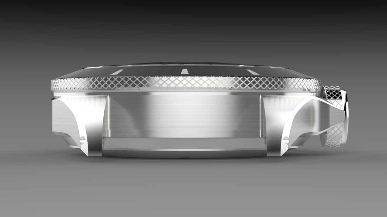
Right off the bat, the design was thick. Not much thicker than the Orion 1, which has some heft, but it also didn’t disguise it well because of the rotating bezel. It was designed around the NH35, to maintain an air of affordability. Bevels, I thought, to give it some elegance and to hide that thickness a bit. Kyle dutifully obliged.

Note the drilled lugs, which I wanted (and still do) to become a hallmark of Orion, but for now, a large crown will have to suffice. The bevels along the case were an improvement, but the thickness still bothered me - and with the NH35 there was, at least not to the degree I wanted it, no hiding it.

Note the evolution from the Orion 1 dial.
Design progressed with the NH35. We started working on a less dressy, more sporty version of the Orion 1 dial, that much was a given. The bezel insert took some time, and somewhere in the mix we even tried a version without crown guards, but I quickly nixed that.

As things moved along, I couldn’t shake the feeling of the thickness. It bothered me so much. I could tell Kyle wasn’t particularly keen on it but I don’t think it bothered him as much, as the thickness was very much par for the course in terms of dive watches, especially microbrand dive watches.
Looking back
On these early Calamity designs, it very much looks like a bloated version of what we ended up with, and to me, almost to a comical degree. One day I told Kyle we were starting over - which he was not happy about. Lots of time had been devoted to a watch using the NH35. We talked about the thinnest movements we could use, “There’s always the Miyota 9015 or 2824.” He suggested. At this point, all the microbrands were crazed about the Miyota and had driven the price up due to demand. The Miyota was close to the ETA 2824 in price, so naturally the 2824 seemed like the logical upgrade, but again, the 2824 is in between the NH35 and 9015 in terms of thickness, which didn’t solve my bloat problem.
“There is the ETA 2892…. It’s 3.6mm but it’s probably too expensive.”
We’re starting over, but with the 2892
I declared. There were a lot of talks. A lot. But the thick diver, it did something to me. It bothered me so much. It bothered me that barely anyone wanted to make thin dive watches. Thick dive watches seemed to become accepted as the norm and almost anticipated - looking at it from a competitive or evolutionary perspective, there was really no pressure in the industry to produce a thin dive watch, because people were okay and happy with chunky dive watches. That wasn’t good enough for me. I wanted to create something amazing. I wanted to make something better than par for the course. The industry did not need ANOTHER chunky dive watch, that would just be creating a product for the sake of having a product, I needed to innovate.

Once the design implemented the 2892
The improvement was instant. It was the clear winner. This freed up a lot of space to be creative, for a little I was having Kyle squeeze thickness out of everything, but it got to a point where, hey, a domed crystal would look nice and we’ve got some thickness to burn, so there that is. There was still a bit of refining to do, we generally begin with the case and move onto other aspects from there. The original large Orion crown was now, proportionally, too large. Overhang was an issue and it just didn’t look right, so that got scaled back to be more proportional to the case (while still being as large as reasonably possible).

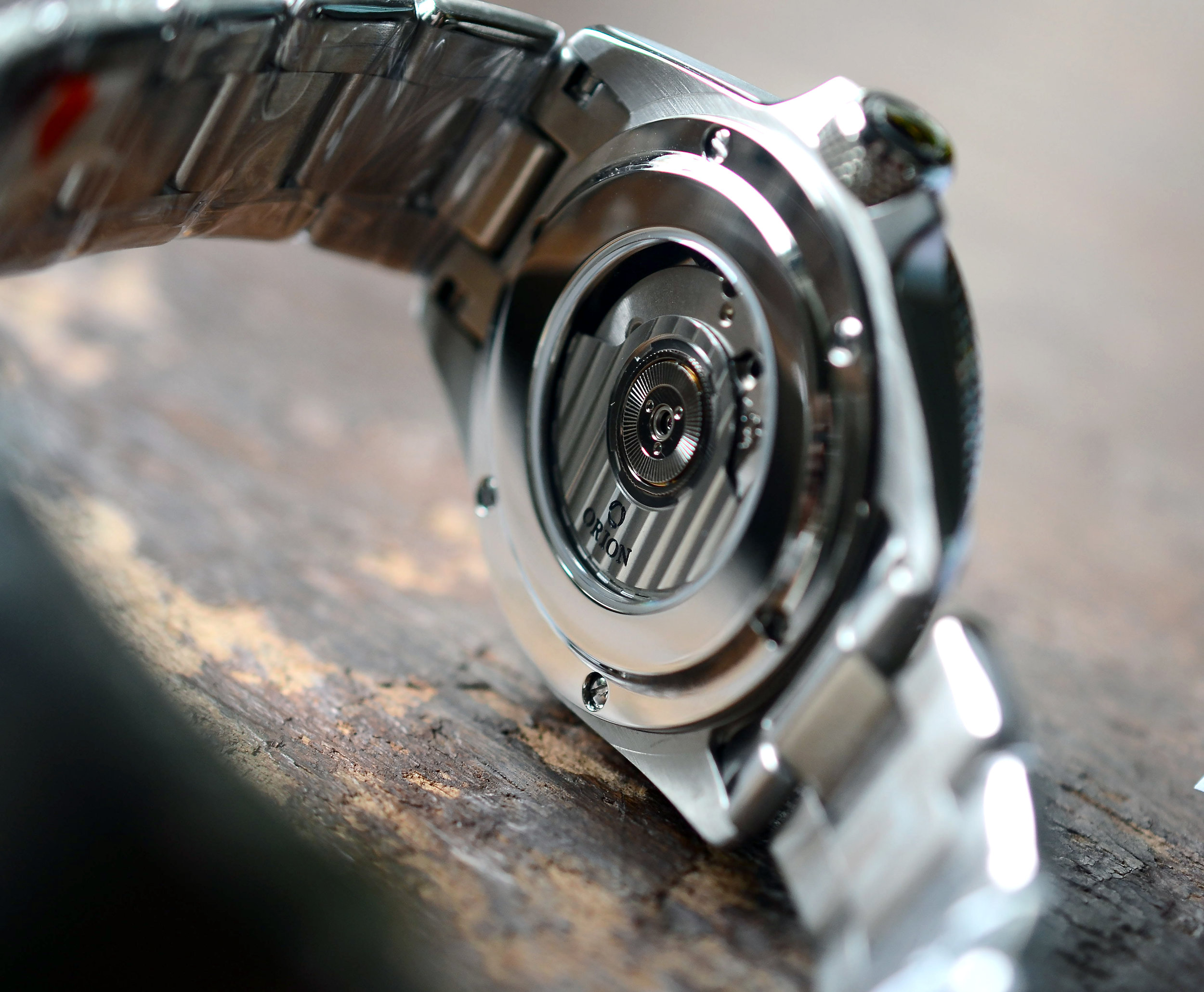
The caseback
Was something I was excited for. I had dreamed of this drop in caseback that would be flush with the case, the idea in it’s purest form wasn’t really possible because of how thin the case frame is, a few conflicting points and tolerance issues. There was this grain that stuck with me, from a Moser watch I had tried at a Red Bar. It had this massive curved sapphire caseback and it just stuck to your wrist like a facehugger or something (I’m sure being cased in white gold helped). And once the sapphire warmed to your skin temperature, it was sublime. I absolutely hate when a good looking watch is uncomfortable, I can’t reconcile it and is absolutely a deal breaker for me. A watch needs to be comfortable or undetectable on my wrist if I’m going to wear it for any duration. This was a very important design directive for the Calamity.

Photo courtesy of SalonQP
The size, shape and overall design of the caseback differed from the Moser, as much as I would love a luxurious slab of contoured sapphire, it’s out of place on a dive watch and the water resistance engineering doesn’t really get along with it either. I wanted the sapphire, not to show off the movement, but for that added bit of comfort for when it warms up to your wrist, it makes the watch disappear that much more.

Advancing the caseback design. 4 screws provide no redundancy or safety.

A teaser render Kyle did, I don’t think we had the dial/hands/bezel done yet.
The case, at this point, was somewhere I was comfortable with. Exceptional thinness, a cool curved caseback (I knew I wanted a curved caseback before I envisioned the dial/hands), and a sexy beveled case. The drilled lugs interrupted the polished bevel in a way that would make people crazy, but gave me some form of sadistic pleasure. A statement, almost, on the priority of drilled lugs over a pretty polished line, but alas, the case frame was too thin and drilled lugs would become a weak spot. I decided that a vulnerability like that countered the concept of a tool/dive watch, however dressed up, so I heeded the manufacturers warning and did away with the drilled lugs. We were getting close, the madness of endless combinations and iterations of dials was about to begin.


But now with red!

Now with curvature added to the 12:00 bezel chevron, and a date, yes we tried a date.
As you can see
Very small changes, tweaks, and refinements warrant countless iterations at this point. Many folks see that you’re in the design phase and think it’s their moment to shine, “Well I like watches! I have a nice collection! I’ll tell these guys what they’re missing!”
No. Please. We’ve tried it. And the chance that you have good design input versus wanting a design feature catered to your personal taste is slim (sorry, not sorry, it’s the truth). We tweak colors, sizes of bevels, undercuts and dots by fractions of a millimeter. We do a lot of variations. Design that works for many people and personal taste are often two different things. I believe good design should feel natural, shouldn’t necessarily look outlandish, but should feature innovations in a way that are disguised and feel like a natural progression of things. With that said, some folks outside of the inner loop do offer great design input. One of my instructors, Lisa, was talking me through some of my bracelet deliberations when she suggested adding a circuitous polished bevel to an Oyster style bracelet. Simple, elegant, increases comfort, looks good but still maintains tool watch aesthetic - I dropped the other ideas and went with it without looking back. The best part? It matches the polished bevel of the case.

Note: Bracelet bevels are larger on production models.
Now talking about the clasp is going to serve a larger purpose. Catalog parts. Microbrands. Microbrand perception in contrast to large brands, and the scrutiny that micros often face.
One of the largest pitfalls of innovative design for microbrands is the reluctance to pay mold fees and use original design. What does this mean? Watch manufacturers often have a literal catalog of parts that they have molds and dies already produced for, the parts therein are available for production without having to pay the cost for creating a mold or die. Many brands use catalog parts, even cases or hands, to save on cost. This can lead to a feeling of sameness or familiarity across microbrands, but also prevents brands from developing a brand aesthetic, or ‘look’.
The clasp, is the only catalog part the Calamity uses. It’s a high quality clasp, solid, with lots of micro-adjusts (and you may have noticed some other microbrands implemented the same clasp on some of their models after it was unveiled on the Calamity). This was a source of contention for a lot of keyboard warriors, mostly because I’m convinced sometimes people just need something to complain about. The ratcheting diver clasps many have suggested are literally thicker than the watch, by a good margin too, and that would be so awkward to have, belying the thinness of the watch. I digress.
The clasp, as mentioned, was a point of contention, perhaps because a clasp is easy prey when everything else is decent. But it’s time to start looking at big brands with the same scrutiny as microbrands. One of the examples that sticks out, brightly, are the new DOXA watches. I love DOXA, let me be clear. I recognize and respect their impact on dive watch and horology history, I love their obnoxious yet hyper functional design, I even own a vintage one! But their clasp, is literally the cheapest catalog clasp you can get from Asia (well one of them). Granted, they have a few different clasps, but this is the one I’m talking about.

Photo courtesy of doxawatches.com
It’s thin, stamped, and rips your fingernails off - and was literally in the same catalog I looked at, but large brands have been given a pass on lots of this stuff (and DOXA is farrrr from the only one who does this, check out Swatch’s brands). There is a whole world of catalog parts that sneak past people, there are also some brands that have exceptional clasps and bracelets (but they are often the exception, not the rule), but the clasp contention opened my eyes to a new struggle I had not experienced with the Orion 1, Field Standard, or Sylph.
So I got to thinking about it. I could think of so many brands, large reputable brands, watches that cost twice as much or even more than the Calamity that used cheaper catalog clasps and received praise for them! Large brands had won the hearts and trust of so many people that they’ve gained immunity from a critical eye, but microbrands, with tenable communication with the talent behind the scenes and the real ability to make a change (from a consumer’s perspective) leaves people clamoring to say something about anything, good or bad.
It’s in this light, I invite people to look critically at all brands, and really look. Brands like Rolex have exceptional, if not the best bracelets/clasps in the game, but what other luxury brands are dressing up catalog clasps? It revealed an opportunity, because there are only really two scenarios, people just don’t know of the widespread use of catalog parts or they want their voice heard, though the reality is most certainly a combination of the two, with more emphasis on the latter by virtue of the attainability of manufacturing catalogs for the average person (but they aren’t hard to get, if you really want one).
With that said, I invite people designing new watches to pass over the catalog parts for things like cases, dials and hands (unless it’s like super innocuous that there’s no point in remaking), but to peruse the catalog for your design just because you want to save some quick cash, seems like wasted potential to me - and the industry could use all the fresh creativity it could take. And yes, an Orion original design clasp is on the list of things to do.

A late rendering with surprising accuracy to production
Fun facts. The Calamity was originally supposed to only be in black and blue. On a whim, we tried a drab green and it looked way better than we expected, so that’s how that happened.

We tried lots of different shades of blue.


Originally, the green was supposed to be so drab it was almost grey, but the spectrum of color attainable with ceramic is limited, so the drab is slightly more green than the original concept, but hey, not bad!

12 hour bezel concept with grey dial.
Overall, this is a very small snapshot of what went into designing the Calamity. Each part could have it’s own deviating story written about it, but I wanted to provide a little bit of a snapshot of the evolution of it, because many of you have the (one of the) final products on your wrist, and it has been a long, more than two years, of refining and design work combined with reworking prototypes and pushing and educating manufacturers. I have learned so much with the Calamity, and I’m excited to apply that to future projects and designs. Yes, I am thinking of a GMT, but there’s something coming sooner than that….

II